Introducing neetoUI v6
February 22, 2024
Introduction
NeetoUI is an open-source React component library developed for neeto. It makes it easier to build accessible and consistent UI in React applications. It is currently being used in more than 20 Neeto products. In this blog post, we will explore the exciting new features and enhancements of neetoUI.
The Spark
Though we were using neetoUI across all our products, we had to avoid neetoUI in certain products that followed a different UI style. For example, NeetoCode, a coding platform built by BigBinary, has its own special design that is drastically different from the established neetoUI style. So, while building the new landing page for NeetoCode, we also had to create custom buttons and form elements that followed the NeetoCode design.
Secondly, neetoUI only supported theme overrides. This means the users could easily override the color scheme of neetoUI just by replacing the color variables. But with NeetoCode, just updating the theme was not enough. From button sizing to border radius and variants, every component was different in the NeetoCode design system. That's when we realized that neetoUI requires even more customization options to improve its adaptability.
The Solution
To enhance the customizability of neetoUI, we planned to implement a set of customization features similar to popular design systems like Bootstrap and Ant design. These features would allow users to adapt the library to their unique design without compromising on the core advantages of using neetoUI. Apart from the color theming which neetoUI already supported, we also wanted to introduce component styling and responsive typography to further advance the customizability of neetoUI.
The Execution
NeetoUI has more than 30+ components, and enhancing the customizability of those components was not an easy task. We approached each component one by one and refactored the respective styles to use CSS variables for all the properties.
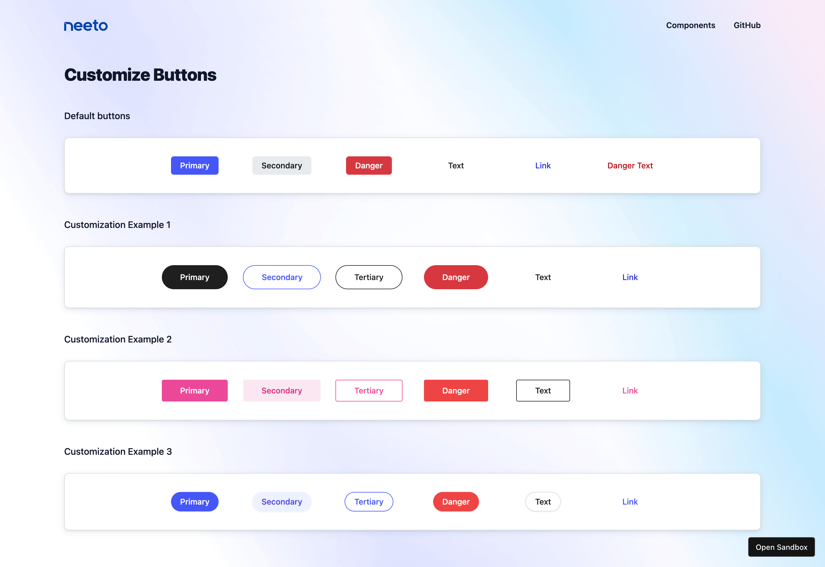
Let’s take the example of the Button component from neetoUI. Earlie,r we could
only customize the colors used in the buttons. But with v6, we have made every
aspect of the button, like padding, border-radius, font size, etc. customizable.
Here is the list of variables used by the Button component.
CSS
--neeto-ui-btn-padding-x: 8px;
--neeto-ui-btn-padding-y: 6px;
--neeto-ui-btn-font-size: var(--neeto-ui-text-sm);
--neeto-ui-btn-font-weight: var(--neeto-ui-font-medium);
--neeto-ui-btn-line-height: 16px;
--neeto-ui-btn-color: rgb(var(--neeto-ui-black));
--neeto-ui-btn-bg-color: transparent;
--neeto-ui-btn-border-width: 0;
--neeto-ui-btn-border-color: transparent;
--neeto-ui-btn-border-radius: var(--neeto-ui-rounded);
--neeto-ui-btn-gap: 4px;
--neeto-ui-btn-icon-size: 16px;
--neeto-ui-btn-box-shadow: none;
--neeto-ui-btn-outline: none;

// Disabled
--neeto-ui-btn-disabled-opacity: 0.5;

// Hover
--neeto-ui-btn-hover-color: rgb(var(--neeto-ui-black));
--neeto-ui-btn-hover-bg-color: transparent;
--neeto-ui-btn-hover-box-shadow: none;
--neeto-ui-btn-hover-opacity: 1;

// Focus
--neeto-ui-btn-focus-color: rgb(var(--neeto-ui-black));
--neeto-ui-btn-focus-box-shadow: none;
--neeto-ui-btn-focus-opacity: 1;

// Focus Visible
--neeto-ui-btn-focus-visible-color: rgb(var(--neeto-ui-black));
--neeto-ui-btn-focus-visible-outline: 3px solid rgba(var(--neeto-ui-primary-500), 50%);
--neeto-ui-btn-focus-visible-outline-offset: 1px;
--neeto-ui-btn-focus-visible-box-shadow: none;
The users can now tweak each property of the Button component using these variables and create their version of the component. You can see it in action, here.

Likewise, we have updated all the components and the new neetoUI storybook has examples on how to override each component.
The Result
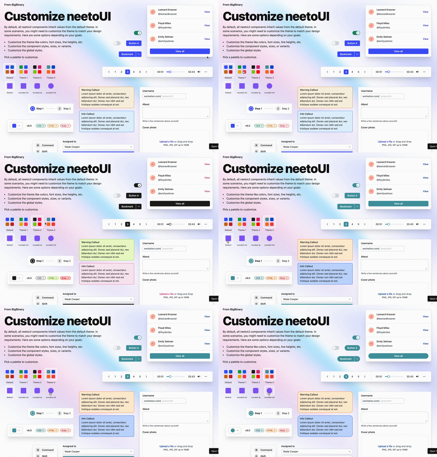
With all the customization improvements, neetoUI v6 has been released to the public. Just by changing a few CSS variables, you can now change the look and feel of neetoUI at both the global and component levels to match your exact design requirements.

Do visit this page to understand the nuances of neetoUI v6 up close.
We hope you have a clearer understanding of the improvements we have made to the library. Do try it out and let us know your feedback.
Follow @bigbinary on X. Check out our full blog archive.
