Understanding the automatic minimum size of flex items
August 17, 2023
Introduction
Flexbox is a powerful CSS layout module that allows us to create flexible and responsive user interfaces. However, when dealing with flex items that contain text, we may encounter issues where the text overflows its container, disrupting the user interface. In this article, we'll explore the problem of text overflow in flex items and learn about the automatic minimum size behavior of flex items.
The problem
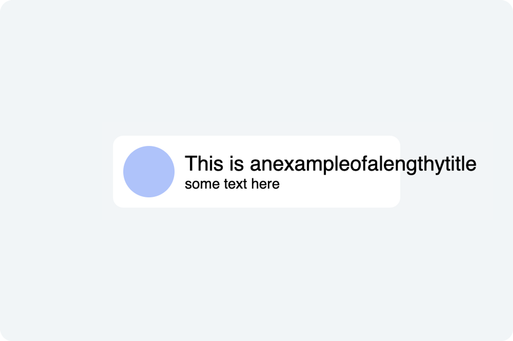
Consider a scenario where we have a card component with a title that can be lengthy. To prevent the card from becoming too large and breaking the layout, we want to truncate the title and show an ellipsis when it overflows its container.
However, even after applying the necessary CSS properties such as
white-space: nowrap, overflow: hidden, and text-overflow: ellipsis to
card__title, the text doesn't truncate as expected. The card content doesn't
shrink to accommodate the overflowing text, resulting in an undesired UI.

HTML
<div class="card">
  <div class="card__avatar"></div>
  <div class="card__content">
    <p class="card__title">This is anexampleofalengthytitle</p>
    <p class="card__description">some text here</p>
  </div>
</div>
CSS
.card {
  display: flex;
  align-items: center;
  width: 260px;
  gap: 10px;
  padding: 10px;
  margin: 20px;
  background-color: #ffffff;
  border-radius: 10px;
}

.card__avatar {
  flex-shrink: 0;
  width: 50px;
  height: 50px;
  background-color: #aac4ff;
  border-radius: 50%;
}

.card__content {
}

.card__title {
  white-space: nowrap;
  overflow: hidden;
  text-overflow: ellipsis;

  font-size: 20px;
  margin: 0;
}

.card__description {
  font-size: 14px;
  margin: 0;
}
Why is it not shrinking?
The default value of
flex-shrink of a
flex item is 1, which means the card__content should be able to shrink as
much as it wants to. Surprisingly, the result is not what we expected!
The flexbox algorithm refuses to shrink a child below its minimum size.
When there is text inside an element, the minimum size is determined by the length of the longest string of characters that cannot be broken.
Flexbox specification:
To provide a more reasonable default minimum size for flex items, the used value of a main axis automatic minimum size on a flex item that is not a scroll container is a content-based minimum size; for scroll containers the automatic minimum size is zero, as usual.
The solutions
To overcome the issue of the flex item not shrinking as expected, we can apply one of the following solutions:
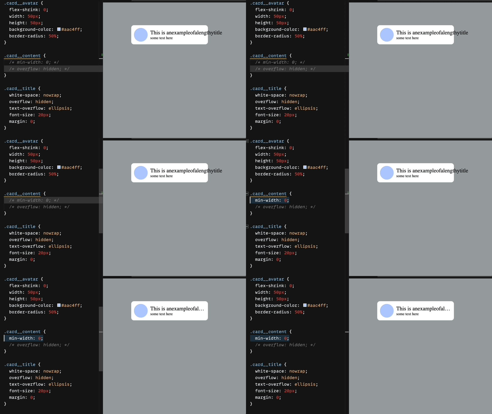
Solution 1 : Set min-width: 0;
.card__content {
  min-width: 0;
}
By explicitly setting min-width: 0; on the flex item, we can override the
default behavior and allow the element to shrink beyond its automatic minimum
size. This change enables the flex item to adjust its size to accommodate the
ellipsis and prevent UI disruption.

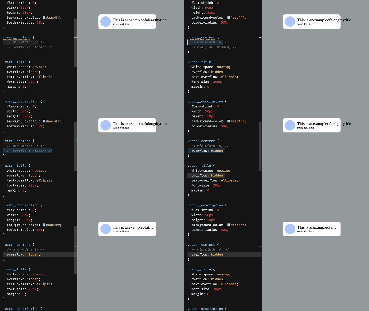
Solution 2: Set overflow: hidden;
.card__content {
  overflow: hidden;
}
Setting overflow: hidden; alone can also help. This property ensures that any
overflowing content is hidden, which indirectly allows the flex item to shrink
properly.

Conclusion
Understanding the automatic minimum size behavior of flex items is crucial for creating effective and visually pleasing web layouts. By implementing the suggested solutions, you can overcome the challenges associated with text overflow and achieve the desired UI outcomes.
Happy coding ❤️
Follow @bigbinary on X. Check out our full blog archive.