Using D3 JS with React JS
February 4, 2016
In this blog, we will see how to plot a simple line chart using ReactJS and D3JS.
If you are not familiar with ReactJS then please take a look at official ReactJS webpage. You can also look at our Learn ReactJS in steps video series.
What is D3.js
D3.js is a Javascript library used to create interactive, dynamic visualizations.
Let's take a step by step look at how we can integrate ReactJS with D3JS to plot some interactive visualizations.
Step 1 - Get ReactJS example working
We will be using JSFiddle example from ReactJS Docs to begin with. Fork the JSFiddle example and you should be good to go.
Step 2 - Add D3.js as an external resource
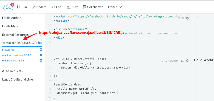
We will be using D3.js from Cloudflare CDN. Add D3.js as an external resource as shown in the image given below and type the following URL as an external resource.
https://cdnjs.cloudflare.com/ajax/libs/d3/3.5.12/d3.js

Step 3 - Build ReactJS components to create visualizations with D3.js
Now let's try to draw a Line Chart using D3.js.
Let's create a Line component that renders line path for the data points
provided.
const Line = React.createClass({
  propTypes: {
    path: React.PropTypes.string.isRequired,
    stroke: React.PropTypes.string,
    fill: React.PropTypes.string,
    strokeWidth: React.PropTypes.number,
  },

  getDefaultProps() {
    return {
      stroke: "blue",
      fill: "none",
      strokeWidth: 3,
    };
  },

  render() {
    let { path, stroke, fill, strokeWidth } = this.props;
    return (
      <path d={path} fill={fill} stroke={stroke} strokeWidth={strokeWidth} />
    );
  },
});
Here in above code, Line component renders an
SVG path.
Path data d is generated
using
D3 path functions.
Let's create another component DataSeries that will render Line component
for each series of data provided. This generates path based on xScale and
yScale generated for plotting a line chart.
const DataSeries = React.createClass({
  propTypes: {
    colors: React.PropTypes.func,
    data: React.PropTypes.object,
    interpolationType: React.PropTypes.string,
    xScale: React.PropTypes.func,
    yScale: React.PropTypes.func,
  },

  getDefaultProps() {
    return {
      data: [],
      interpolationType: "cardinal",
      colors: d3.scale.category10(),
    };
  },

  render() {
    let { data, colors, xScale, yScale, interpolationType } = this.props;

    let line = d3.svg
      .line()
      .interpolate(interpolationType)
      .x(d => {
        return xScale(d.x);
      })
      .y(d => {
        return yScale(d.y);
      });

    let lines = data.points.map((series, id) => {
      return <Line path={line(series)} stroke={colors(id)} key={id} />;
    });

    return (
      <g>
        <g>{lines}</g>
      </g>
    );
  },
});
Here in above code d3.svg.line creates a new line generator which expects input as a two-element array of numbers.
Now we will create LineChart component that will calculate xScale, yScale
based on data and will render DataSeries by passing xScale, yScale, data
(input x,y values), width, height for the chart.
const LineChart = React.createClass({
  propTypes: {
    width: React.PropTypes.number,
    height: React.PropTypes.number,
    data: React.PropTypes.object.isRequired,
  },

  getDefaultProps() {
    return {
      width: 600,
      height: 300,
    };
  },

  render() {
    let { width, height, data } = this.props;

    let xScale = d3.scale
      .ordinal()
      .domain(data.xValues)
      .rangePoints([0, width]);

    let yScale = d3.scale
      .linear()
      .range([height, 10])
      .domain([data.yMin, data.yMax]);

    return (
      <svg width={width} height={height}>
        <DataSeries
          xScale={xScale}
          yScale={yScale}
          data={data}
          width={width}
          height={height}
        />
      </svg>
    );
  },
});
Here d3.scale.ordinal constructs an ordinal scale that can have discrete domain while d3.scale.linear constructs a linear quantitative scale.
You can learn more about D3 Quantitative scales here.
Now we need to call LineDataSeries component with the data.
let data = {
  points: [
    [
      { x: 0, y: 20 },
      { x: 1, y: 30 },
      { x: 2, y: 10 },
      { x: 3, y: 5 },
      { x: 4, y: 8 },
      { x: 5, y: 15 },
      { x: 6, y: 10 },
    ],
    [
      { x: 0, y: 8 },
      { x: 1, y: 5 },
      { x: 2, y: 20 },
      { x: 3, y: 12 },
      { x: 4, y: 4 },
      { x: 5, y: 6 },
      { x: 6, y: 2 },
    ],
    [
      { x: 0, y: 0 },
      { x: 1, y: 5 },
      { x: 2, y: 8 },
      { x: 3, y: 2 },
      { x: 4, y: 6 },
      { x: 5, y: 4 },
      { x: 6, y: 2 },
    ],
  ],
  xValues: [0, 1, 2, 3, 4, 5, 6],
  yMin: 0,
  yMax: 30,
};

ReactDOM.render(
  <LineChart data={data} width={600} height={300} />,
  document.getElementById("container")
);
An element with id container is replaced with content rendered by LineChart.
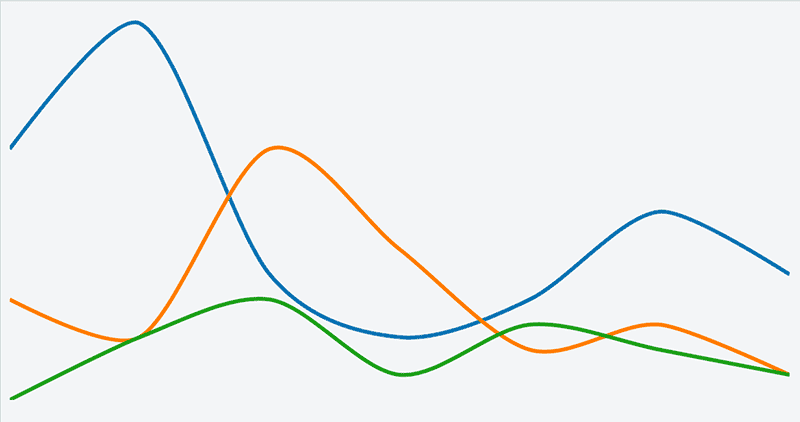
If we take a look at the output now, we see how the Line Chart gets plotted.

To build complex visualizations in a modularized fashion, we can use one of the open source libraries mentioned below based on their advantages and disadvantages.
ReactJS + D3.js Open Source Projects
Here are two popular open source ReactJS + D3.JS projects.
react-d3
Pros
- Supports Bar chart, Line chart, Area chart, Pie chart, Candlestick chart, Scattered chart and Treemap.
- Legend support.
- Tooltips support.
Cons
- No support for Animations. You can implement animations using D3 Transitions.
- Only stacked Bar chart support.
react-d3-components
Pros
- Custom scales support.
- Supports Bar chart (Stacked, Grouped), Line chart, Area chart, Pie chart, Scattered chart.
- Tooltips support.
Cons
- No Legend support.
- No support for Animations.
Summary
Below is final working example of JSFiddle built in the post.
Follow @bigbinary on X. Check out our full blog archive.