---
title: "Perfecting mobile responsiveness on NeetoSite using RFS"
description: "Perfecting mobile responsiveness on NeetoSite using RFS"
canonical_url: "https://www.bigbinary.com/blog/perfecting-mobile-responsiveness-on-neetosite-using-rfs"
markdown_url: "https://www.bigbinary.com/blog/perfecting-mobile-responsiveness-on-neetosite-using-rfs.md"
---
# Perfecting mobile responsiveness on NeetoSite using RFS
Perfecting mobile responsiveness on NeetoSite using RFS
- Author: Praveen Murali
- Published: November 23, 2023
- Categories: UI
### Introduction
Responsive design has become fundamental to modern web development as users
access websites from various devices with varying screen sizes.
[NeetoSite](https://www.neeto.com/neetosite) is a website-building tool by
[Neeto](https://www.neeto.com/). We strive for a great user experience on all
devices for sites built using NeetoSite.
This blog will discuss implementing responsive typography, padding, and margin
using the RFS package.
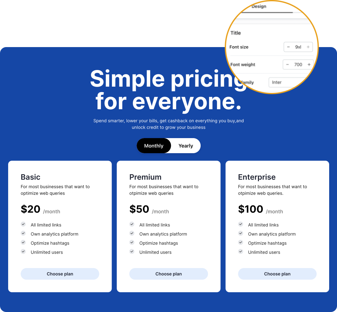
At NeetoSite, users can personalize font sizes from the design page. If a user
selects the largest font size (`9xl`) for the **title**, everything looks
flawless on the desktop view. However, when switching to mobile, things start to
look a little off. The title appears out of place, and that's because we had
been using the same font size for both desktop view and mobile view.
**Desktop view**
**Mobile view**
### Limitations of the Tailwind approach
We use Tailwind CSS to create the building blocks of NeetoSite. One way to
implement responsive typography is to use
[Tailwind's responsive font size classes](https://tailwindcss.com/docs/font-size#breakpoints-and-media-queries).
For example, to make the text `60px` on large desktop screens, we can use the
`lg:text-6xl` class.
```html
Text
```
Now we need to choose the font size for mobile and tablet devices. Let's say we
choose `30px` for mobile and `48px` for tablets. We need to add additional
Tailwind classes:
```html
Responsive text
```
- The `text-3xl` class makes text `30px` on mobile.
- The `md:text-5xl` class will set the font size to `48px` on tablet devices.
Now, let's dive into a practical example within NeetoSite. This platform
provides users with the flexibility to customize font sizes for their content
from the design page.

NeetoSite offers a total of 13 font size variants, each associated with its
default desktop value, as shown in the table below.
| Font size variant |
Font size (Desktop) |
| 9xl |
4.5rem (72px) |
| 8xl |
3.75rem (60px) |
| 7xl |
3rem (48px) |
| 6xl |
2.5rem (40px) |
| 5xl |
2.25rem (36px) |
| 4xl |
2rem (32px) |
| 3xl |
1.75rem (28px) |
| 2xl |
1.5rem (24px) |
| xl |
1.25rem (20px) |
| lg |
1.125rem (18px) |
| base |
1rem (16px) |
| sm |
0.875rem (14px) |
| xs |
0.75rem (12px) |
For each font size variant, **the challenge is to determine the optimal font
sizes for tablets and mobile devices**. Once we have chosen the font sizes for
mobile and tablet, we need to apply the corresponding Tailwind classes, as
mentioned above. It can indeed involve a substantial amount of work and effort,
doesn't it?
### The solution - RFS package
#### What is RFS?
Bootstrap’s side project [RFS](https://github.com/twbs/rfs) is a unit resizing
engine that was initially developed to resize font sizes (hence its abbreviation
for Responsive Font Sizes). It's a great tool for creating responsive typography
and layouts, as it automatically calculates the appropriate values based on the
dimensions of the browser viewport. Nowadays, RFS is capable of rescaling most
CSS properties with unit values like margin, padding, border-radius, or even
box-shadow.
#### Using RFS
The `rfs()` mixin provides shorthands for common CSS properties with unit
values, such as `font-size`, `margin`, and `padding`. This makes it easy to use
RFS to create responsive CSS.
Importantly, we don't need to worry about creating complex media queries to
achieve responsive font sizes. RFS handles this for us.
For example, to set the font size of a `.title` class to be responsive, you
would use the following Sass code.
```css
.title {
@include font-size(4rem);
}
```
The above Sass code will generate the following CSS output.
```css
.title {
font-size: calc(1.525rem + 3.3vw);
}
@media (min-width: 1200px) {
.title {
font-size: 4rem;
}
}
```
In the generated CSS, the font size is set to `calc(1.525rem + 3.3vw)`. This
formula takes a base size of `1.525rem` and adds `3.3%` of the viewport width
(`vw`). As the viewport width changes, the font size dynamically adjusts to
ensure optimal readability and aesthetics. If the viewport width is greater than
`1200px`, the built-in media query in the generated CSS sets the font size back
to the user-defined value of `4rem`.
#### Visualisation
The following visualization shows how RFS rescales font sizes based on the
viewport width.
Note that every font size is generated in a combination of `rem` and `vw` units,
but they are mapped to `px` in the graph to make it easier to understand.

The X-axis represents the viewport width in pixels. The Y-axis represents the
font size in pixels. The colored lines represent the different font sizes that
can be generated using RFS.
As you can see, the font sizes are scaled down as the viewport width decreases.
This ensures that the text is readable on all devices, regardless of the screen
size.
### How we applied RFS on NeetoSite
We created custom CSS classes for each font size variants and applied RFS to
them. RFS automatically calculates the appropriate values based on the browser
viewport, so the font size scales down pleasingly.
```css
.ns-font-9xl {
@include font-size(4.5rem !important);
}
.ns-font-8xl {
@include font-size(3.75rem !important);
}
.ns-font-7xl {
@include font-size(3rem !important);
}
.ns-font-6xl {
@include font-size(2.5rem !important);
}
.ns-font-5xl {
@include font-size(2.25rem !important);
}
.ns-font-4xl {
@include font-size(2rem !important);
}
.ns-font-3xl {
@include font-size(1.75rem !important);
}
.ns-font-2xl {
@include font-size(1.5rem !important);
}
.ns-font-xl {
@include font-size(1.25rem !important);
}
.ns-font-lg {
@include font-size(1.125rem !important);
}
.ns-font-base {
@include font-size(1rem !important);
}
.ns-font-sm {
@include font-size(0.875rem !important);
}
.ns-font-xs {
@include font-size(0.75rem !important);
}
```
Similarly we created custom CSS classes for each padding and margin variants and
applied RFS to them.
#### RFS fluid rescaling in action

### How RFS transformed NeetoSite
- **Improved mobile responsiveness**: With RFS, we were able to effortlessly set
responsive font sizes, paddings, and margins for different screen sizes,
ensuring a seamless and visually pleasing experience across devices.
- **Simplified user customization**: Users could continue customizing font
sizes, but now with the added benefit of automatic responsiveness, eliminating
the burden of setting tablet and mobile values manually.
- **Enhanced readability**: RFS helps ensure that the text remains readable at
all screen sizes.
- **Improved consistency**: The use of RFS ensures that the typography, padding,
and margin of all NeetoSite blocks are consistent across all devices. This is
because it scales all of the padding and margin values based on the same
formula.
### See RFS in action
Take a look at [BigBinary Academy](https://bigbinaryacademy.com/), a place to
learn coding powered by NeetoSite. Recent changes have brought about a
significant improvement in mobile responsiveness. Another example of successful
RFS implementation can be found at https://neetocode.com, a coding platform
built by BigBinary.
## Links
- [Human page](https://www.bigbinary.com/blog/perfecting-mobile-responsiveness-on-neetosite-using-rfs)